Case Study
End-to-end product design for a human-resource management system — turning everyday HR tasks like attendance, leave, payroll and recruitment into a clear, self-service experience across web and a companion mobile app.
Overview
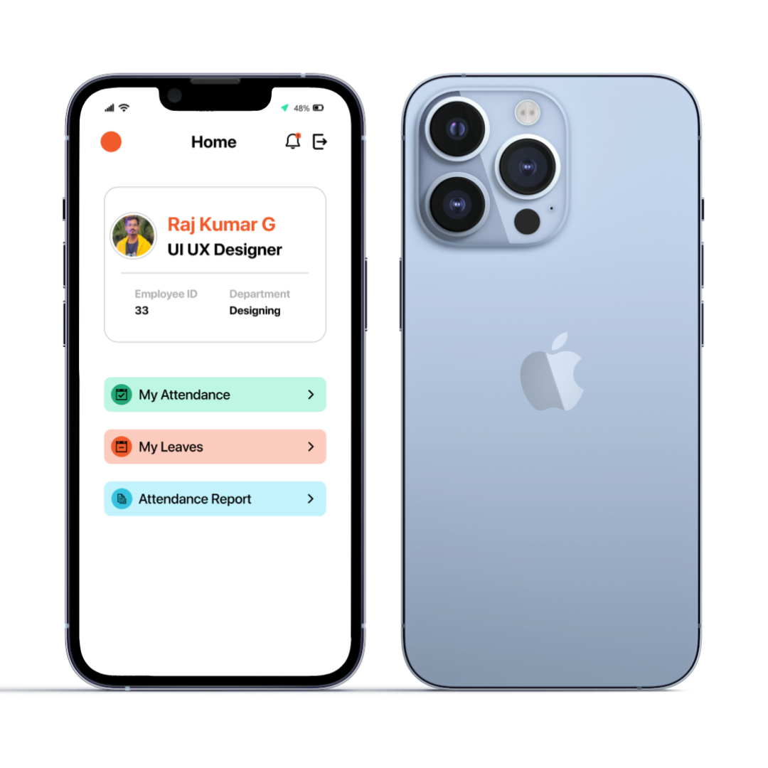
PulseHRM is a human-resource management product that brings core HR operations — attendance, leave, payroll and recruitment — into one system, with a mobile app that lets employees handle everyday tasks themselves rather than routing everything through HR.
My work spanned the product design end to end: shaping the information architecture and key user flows, designing the interface for both the web product and the employee mobile app, and building a reusable component library and design system so the experience stayed consistent as modules were added.
The result is an interface that keeps dense HR functionality approachable — clear status cues, guided forms, and a calm, legible layout that works for people who aren’t HR specialists.
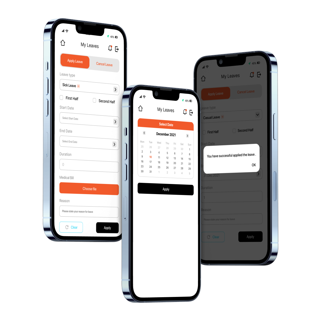
Applying for leave is one of the most frequent things an employee does, so it needed to feel effortless. The flow walks through leave type, half-day options, dates and duration, an optional supporting document and a reason — then confirms clearly once submitted, so there’s no doubt the request went through.
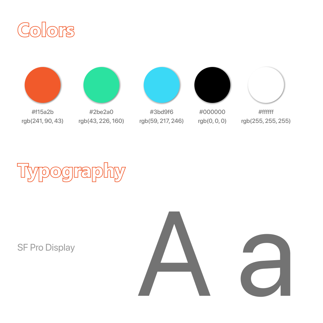
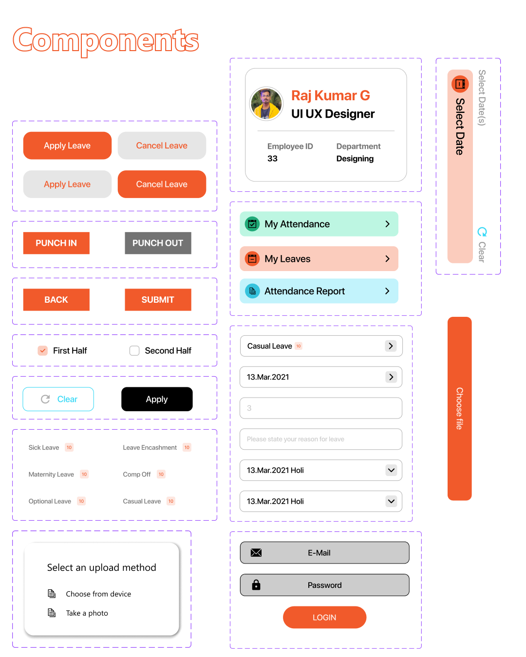
To keep the product coherent as it grew, I built a shared foundation: a defined colour palette, type scale on SF Pro Display, an icon set, and a library of reusable components — buttons and their states, the profile card, list items, form fields, date and file pickers, and status-coloured menu rows.
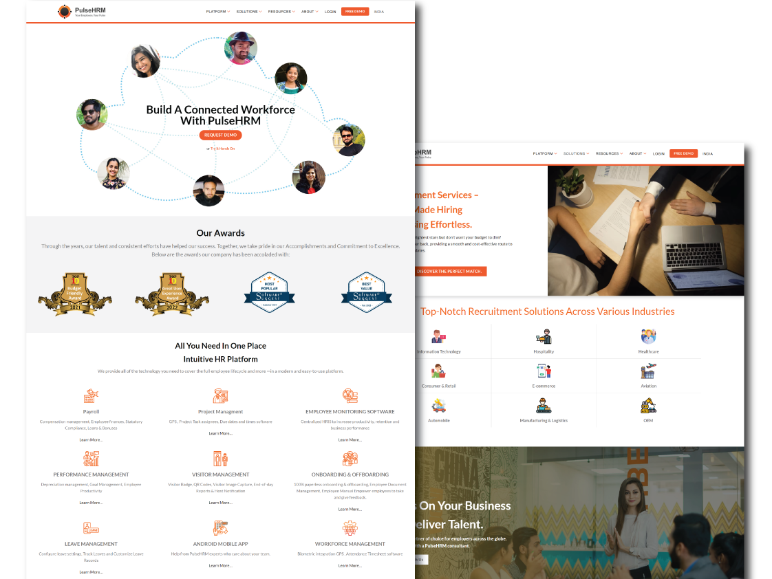
Alongside the app, the product is presented on the web — communicating what PulseHRM does and who it’s for, and carrying the same visual language across to the marketing surface.